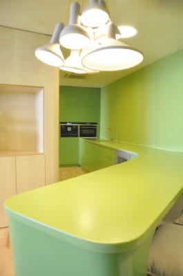
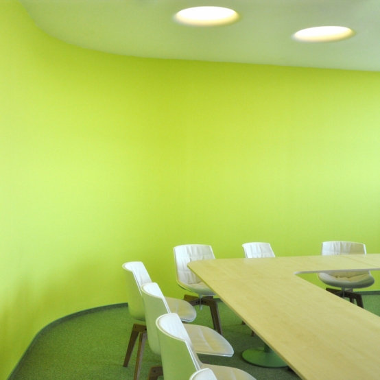
Modernminimalis.com - Office Room Design. Zatopek consulting offices were designed as a combination of open space and separate offices. The main objective was to create a home and a nice place for creative work. The rounded shapes of color and material solutions support a harmonious environment.
 |
| Offices consuting Zatopek - Photo © Stefan Sulek- Modernminimalis.com |
 |
| Offices consuting Zatopek - Photo © Stefan Sulek- Modernminimalis.com |
 |
| Offices consuting Zatopek - Photo © Stefan Sulek- Modernminimalis.com |
 |
| Offices consuting Zatopek - Photo © Stefan Sulek- Modernminimalis.com |
 |
| Offices consuting Zatopek - Photo © Stefan Sulek- Modernminimalis.com |
 |
| Offices consuting Zatopek - Photo © Stefan Sulek- Modernminimalis.com |
Material
Wall / Gypsum fiber bent structure / at the entrance and main meeting rooms are finished with a bright yellow color symbolizes energy. Common areas such as reception, kitchen with bar and corridors are green. Free-standing furniture is made of maple wood.Disposition
Common area / staging area / kitchen with a bar associated with the reception. Storage center, which includes boxes for the reception, and wardrobe space for printers, bar separates from the external environment and allows the creation of space for occasional sleeping. The main meeting room is placed at the entrance shape adapted so that it can be used for educational programs. The open part of the office is separate from the common green space with a fountain.| Name | Zatopek Consulting Offices | |||
| Locality | Bratislava SK 115 tower | |||
| Author | Stefan Sulek | |||
| Realization | 2012 |


Beautiful green office.
ReplyDeleteGo green. I like green and yellow combination design. anti-fatigue mats & specialty flooring
ReplyDelete